How We Partnered with Skin Care Giant, Aēsop for its Houston & Toronto Stores and Created Our Most Ambitious Concrete Pieces Yet
Established in 1987, Aēsop is a world-renowned skin, hair and body care company headquartered in Melbourne, Australia with offices and stores around the globe. When considering new locations for stores, Aēsop says it is their intention to “weave themselves into the fabric of the street and add something of merit rather than impose a discordant presence”.
Back in 2003, Aēsop hosted its first in-store customers in an underground nook in what once was a narrow ramp descending into an underground carpark. This initial storefront they claim, “set the benchmark for future architectural ambitions” as their first consideration is always to work with what is already in place, “treading lightly with respect for the past, present and future”.
When considering a new design for a product, art piece or installation, we employ a similar minimalist approach, individually hand-crafting multifunctional furniture and architectural elements in clean, geometric forms, as we seek to achieve a sort of elevated utilitarianism. That’s why, when Aēsop approached us to be a part of their new Toronto and Houston stores, we were thrilled to partner with a company that shares such a similar vision and ethos.
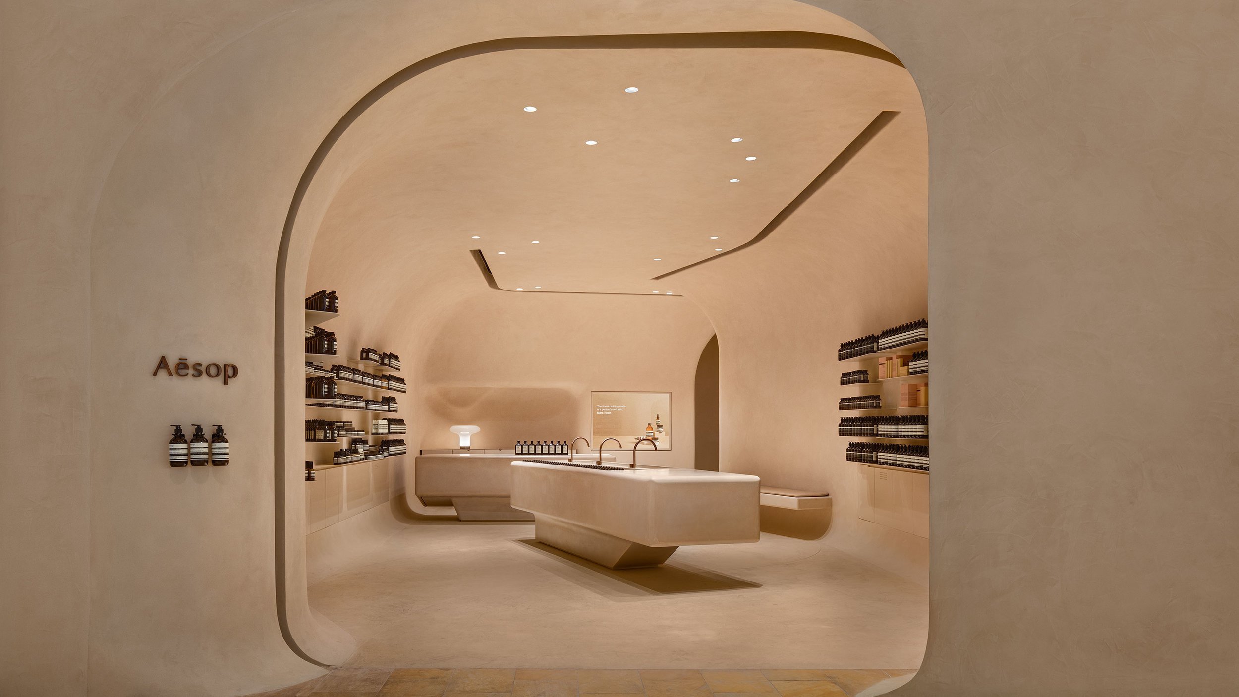
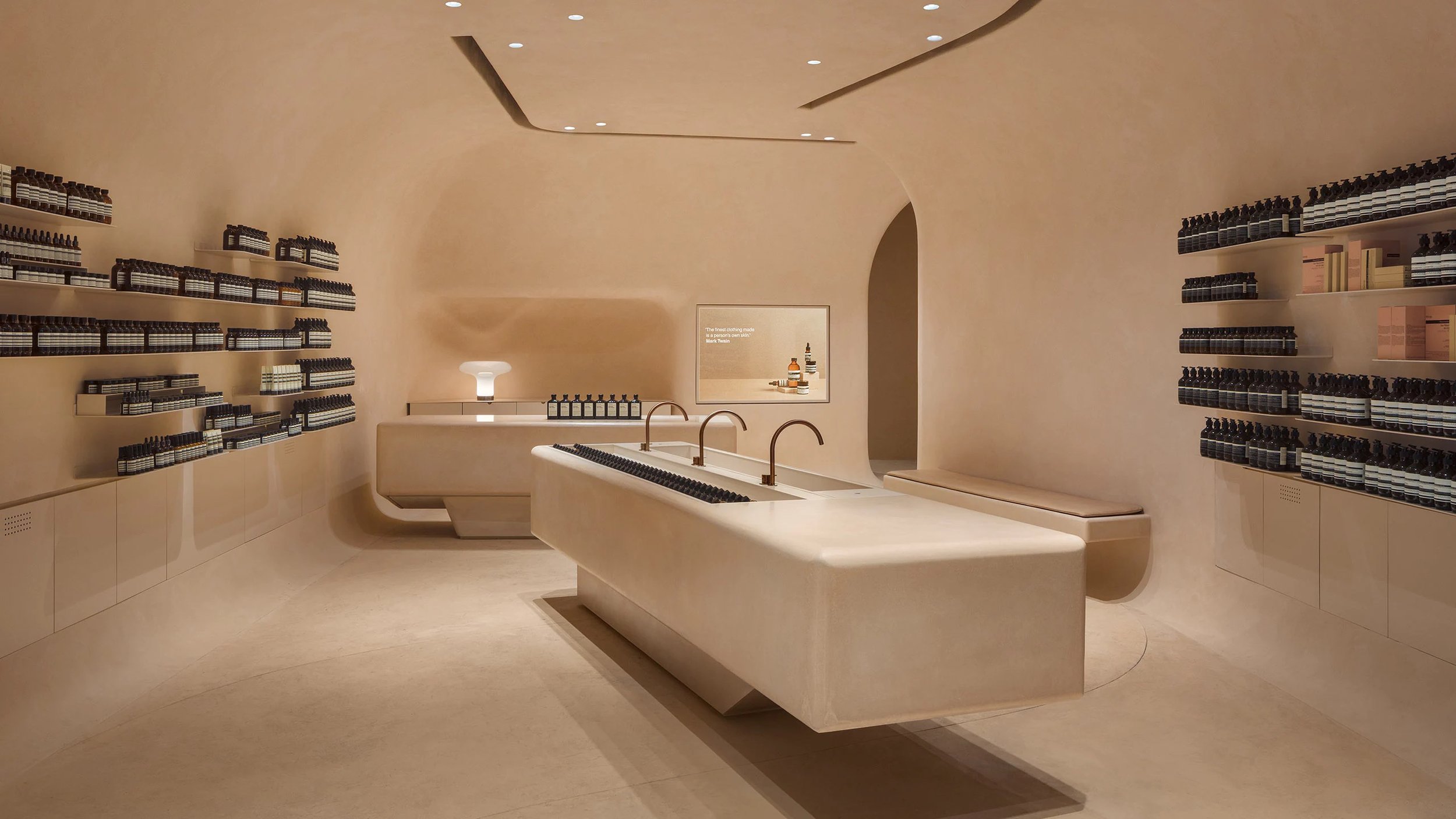
Staying true to their mission, they came to us seeking to make a variety or sleek, minimal pieces of furniture and architectural elements that would compliment the rest of the designs featured in their stores. For the Toronto store, they wanted a monotone, solid-paneled look and a massive, custom-commissioned central sink; For their Houston location, they opted for a massive, cantilevered sink and countertop which can be seen below.
Such an ambitious set of projects, these two orders were not without their respective challenges. First off, the Toronto sink was by far the largest sink we had ever created - so massive that we actually would joke about how it was really a small pool! Because of the distance between our studio in Brooklyn and their shop in Canada, all of the elements for this store had to be made in pieces and assembled on site. This meant that the castings had to be perfect matches to the computer files or else we would have had an international disaster to deal with.
For the Houston project, these pieces required enormous molds while the pieces themselves had to be casted as thin as possible so they could be cantilevered, otherwise we risked having them fall apart. To solve for this, we packed the pieces with fiberglass and were able to keep the weights low enough which was extremely challenging given how the larger section was 12 feet long.
For the Toronto store, the enormous circular sink was easily the most intricate piece. Fully equipped with all sorts of holes and structural elements that were totally hidden from the viewer’s eye, we really pushed ourselves to achieve the standard of sleek quality that both us and the client required.
Looking back on the two jobs, if I had to choose, I’d say Houston was probably the most challenging thing we have ever made. This thing was really big, had to be fabricated to be really lightweight, needed to have large voids in the middle, and to top it all off, it had to be cast and then moved around the shop to be polished before finally being driven across the country, and set into place without cracking.
Once we completed each of the respective elements, it was all in the hands of the logistics companies. Thankfully for all parties involved, everything arrived safe and sound in each of the locations. On the Houston job, we had to work with the plastering company that was doing the walls to make sure that our pieces and their walls matched each other exactly when it came to the color.
Despite the distance, design challenges and logistical hurdles, we were able to get both projects done successfully and everything came out perfectly. Funnily enough, when the project first started, the client’s design team didn’t even believe such a challenging design was feasible but figured they’d ask anyways to see what could be done. Much to their surprise, we were able to complete the design without compromising anything. Looking back on it, it’s projects like these that make us realize why we do what we do. We not only look forward to these types of design and fabrication challenges, we welcome them with open arms!


